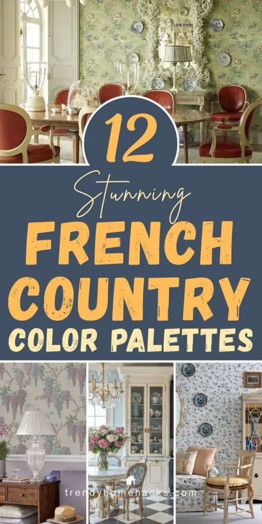
French Country color palettes have a way of making a space feel like home. Maybe it’s the way the colors feel sun-washed and lived-in, or how each shade seems to hold a bit of history. It’s a style that never tries too hard—quiet, warm, and effortlessly beautiful.
The right palette sets the tone. It softens a room. It welcomes you in. And it brings a sense of calm that doesn’t fade with time.
These twelve French Country color palettes are inspired by the beauty of the everyday. Think linen curtains that catch the morning light. Weathered stone walls. The garden just outside the kitchen door. Whether you’re choosing paint for a new space or simply dreaming of a fresh start, let these colors guide you toward something beautiful, and entirely your own.
1. Lavender & Linen: A Provençal Dream
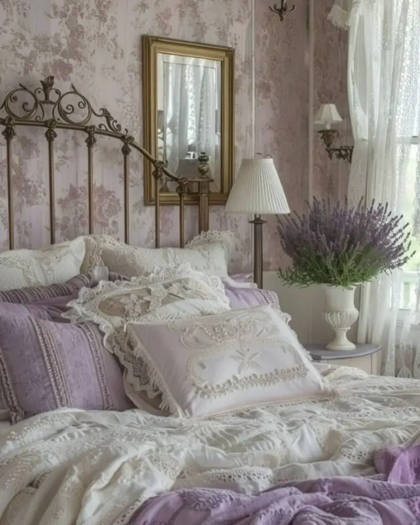
This palette captures the stillness of early mornings in the French countryside; soft light, gentle air, and a sense of calm. Lavender adds a soft bloom of color—gentle, not fussy. It whispers rather than shouts, offering just enough presence to feel special. Linen tones balance it with warmth and wear, like old fabric that’s faded just enough.
Together, they create a space that feels peaceful, lived-in, and full of light. It’s a combination made for slowing down. Perfect for bedrooms, reading corners, or an entryway where you want calm to greet you first.
Layer in texture with linen drapes, a simple quilt, or a weathered bench. These hues are about comfort rather than perfection.
Bring this look to life in your foyer with ideas from our post on creating a charming French Country entryway.
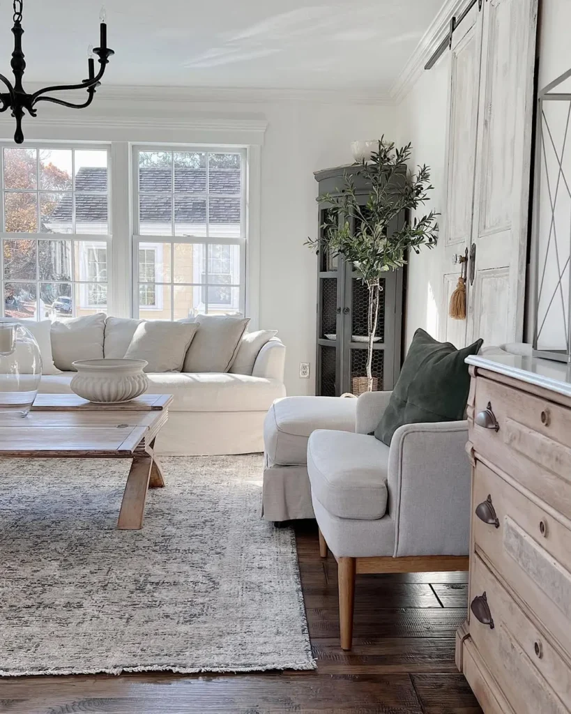
2. Olive Green & Wheat: Earthy and Elegant
There’s a quiet richness in this pairing, rooted, natural, and full of character. Olive green grounds a space with depth, while wheat adds a soft, golden light. Together, they feel like the colors of a hillside in Provence after harvest.
This palette works beautifully in kitchens, breakfast nooks, and anywhere that invites gathering. It’s practical but warm. Lived-in but never dull. It’s also a beautiful choice for porches and patios, especially when you’re creating a cozy French Country backyard garden.
Use matte finishes to keep it subtle. Woven textures and wood accents help the tones feel even more at home.
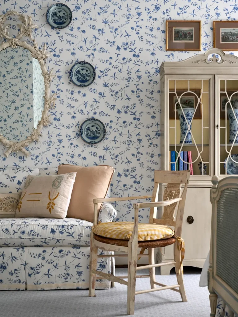
3. Misty Blue & Aged White: Timeless and Tranquil
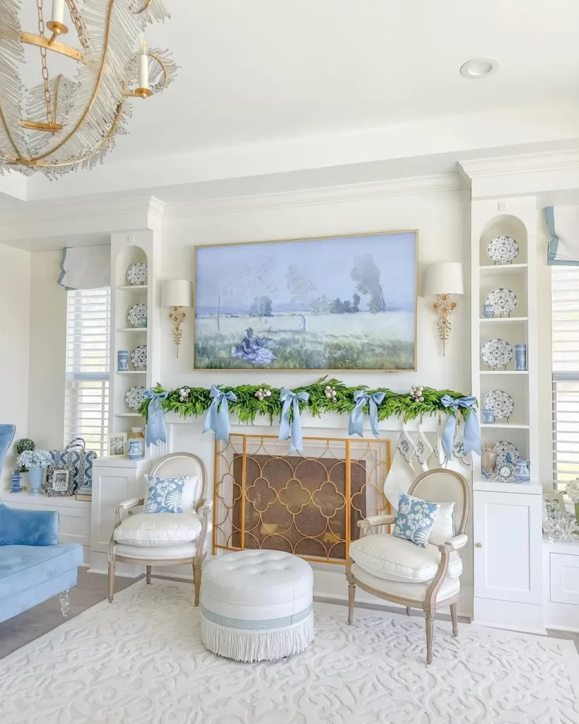
This is the palette of soft skies and worn plaster. Cool, calming, and full of quiet charm. Misty blue brings a breath of fresh air into the room. Aged white adds softness, like walls that have weathered over time in the best possible way.
Together, they feel timeless. Gentle enough for a bedroom, clean enough for a bathroom, and light enough to make small spaces feel open.
For bathrooms in particular, this pairing creates a serene retreat, especially when paired with vintage hardware and stone textures. You’ll find more inspiration in our post on French Country bathroom decor ideas.
4. Terracotta & Dusty Rose: Rustic Romance
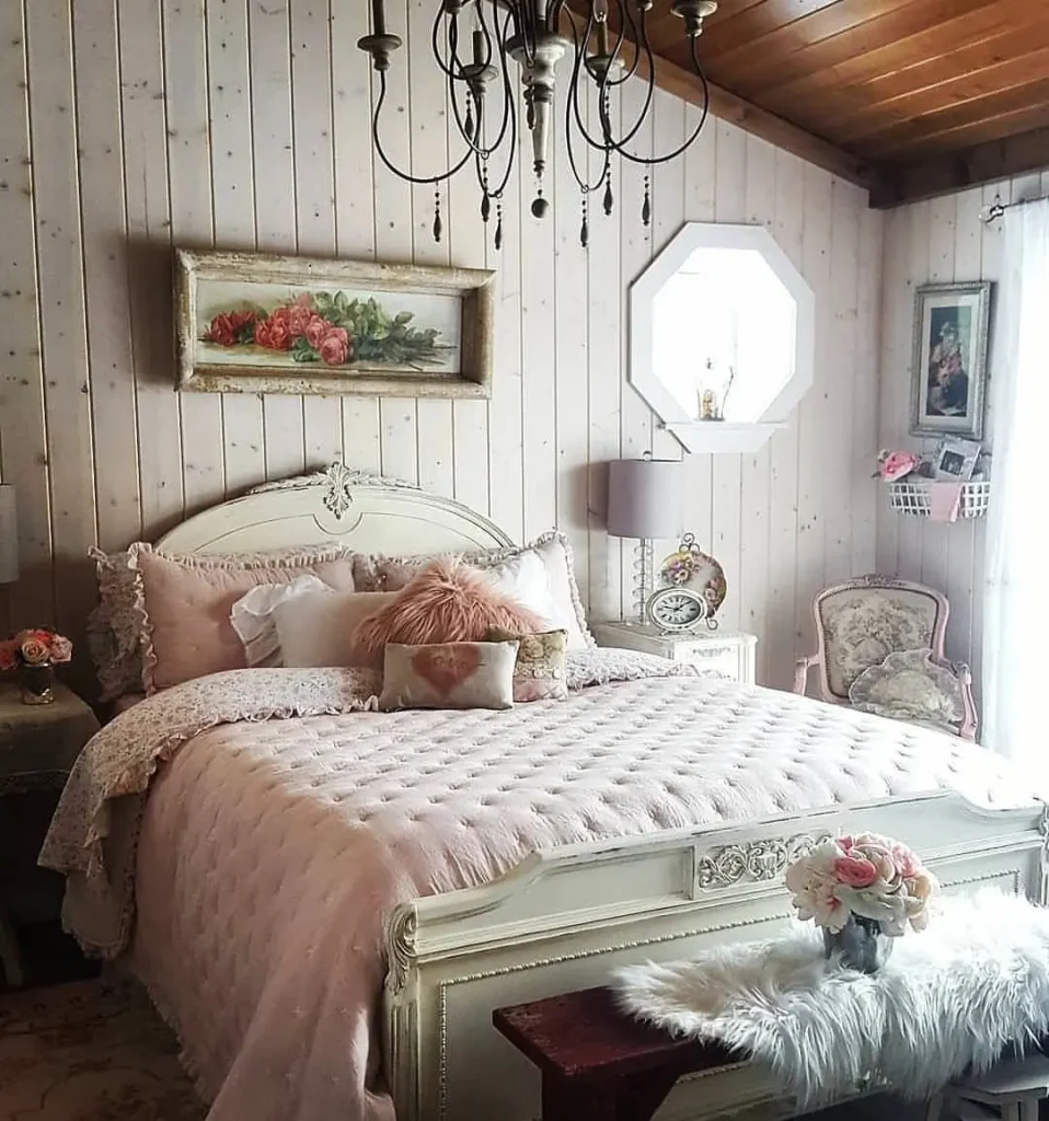
There’s a certain warmth that only earth tones can bring, and this palette leans into that feeling fully. Terracotta is rich and grounded, like sunbaked clay. Dusty rose softens the edges, adding a gentle, timeworn sweetness.
Together, they feel nostalgic and cozy. Perfect for living rooms, sitting areas, or even a hallway where you want warmth to linger. These shades are especially beautiful in spaces that balance comfort and elegance, like those featured in our guide to French Country living room design.
This pairing works well with exposed beams, linen slipcovers, and layered rugs. The more texture, the better.
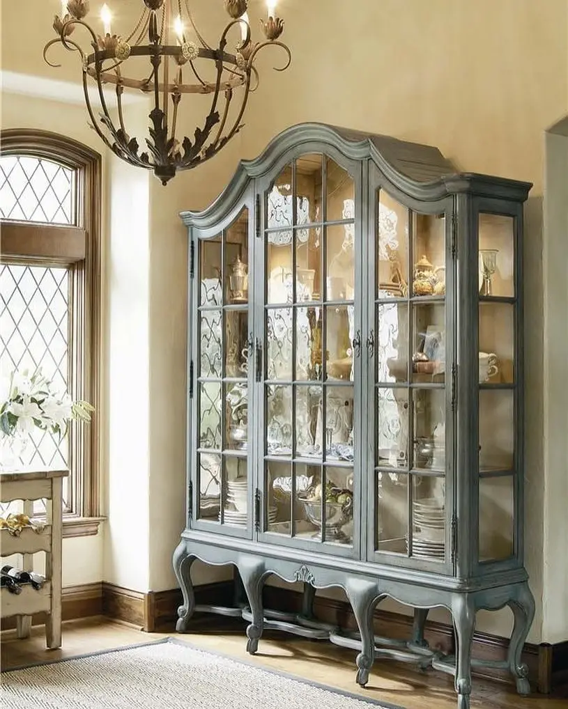
5. Cream & Slate: Understated Sophistication
This palette is all about quiet balance. Cream offers warmth and softness. It gives the room a glow without adding color. Slate brings in depth and contrast, grounding the space with a sense of calm.
Used together, they create a look that feels refined but never cold. It’s an ideal combination for bedrooms that call for stillness and simplicity. If you’re furnishing the space from scratch, consider layering these tones with pieces featured in our post on elegant French Country bedroom furniture.
Keep the palette clean with natural textures, brushed cotton, aged wood, and soft wool blankets all work beautifully.
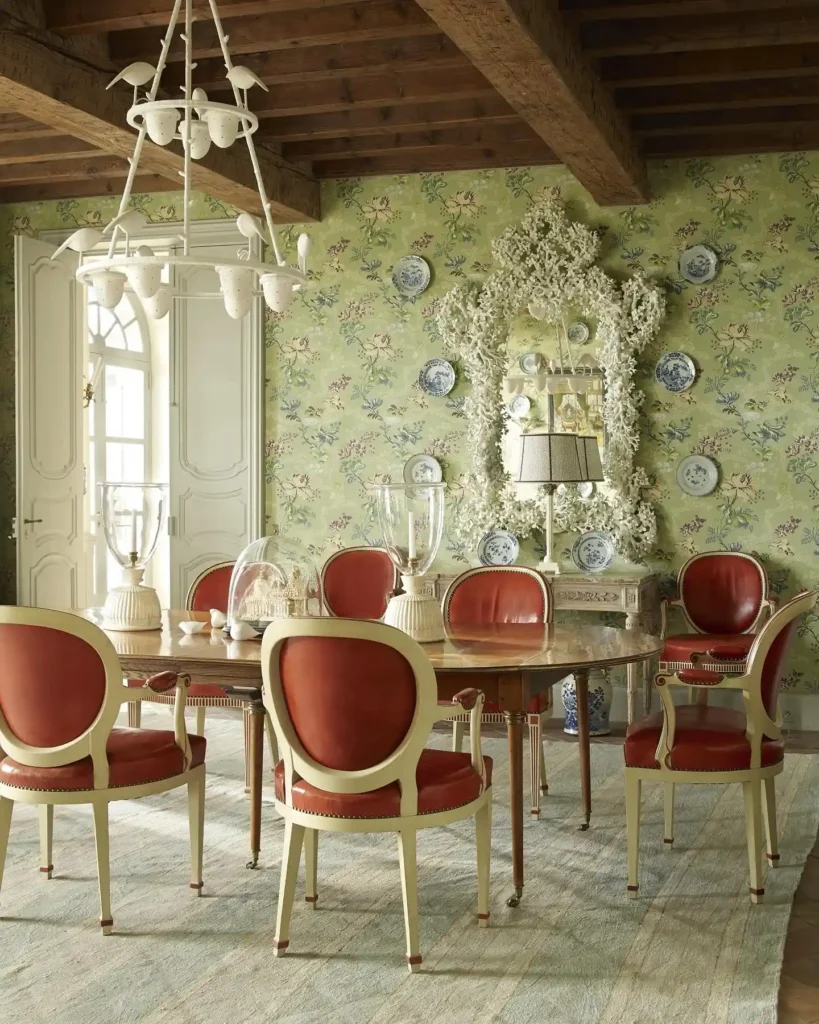
6. Duck Egg Blue & Antique Gold: Delicate Meets Dramatic

This palette is soft and refined, with just the right touch of drama. Duck egg blue brings a powdery lightness, like painted shutters on a country house. Antique gold adds contrast and elegance, catching the light without ever feeling flashy.
Together, they elevate a room while keeping it grounded. Perfect for formal dining rooms, powder rooms, or sitting areas that lean a little more refined. To complete the look, consider the role of elegant French Country dining room lighting—fixtures that bring warmth and history into the space.
These tones pair beautifully with dark wood, vintage mirrors, and glass-front hutches.
7. Sage & Putty: Soft Greens and Stone Hues
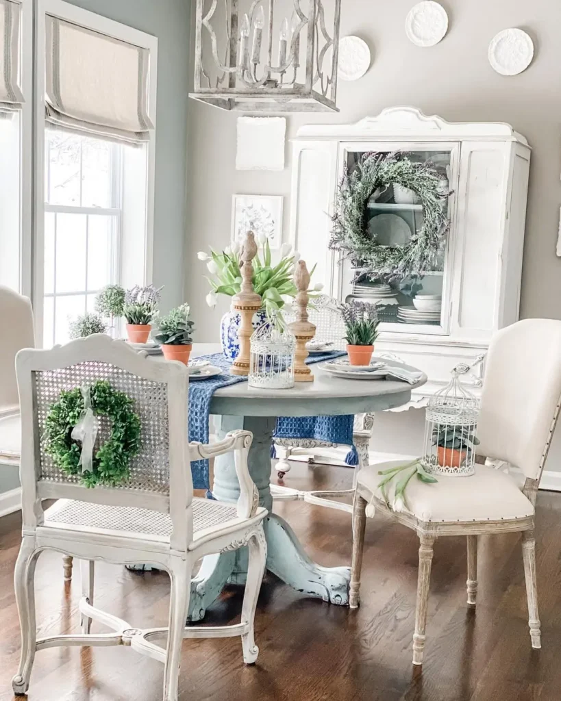
Sage is a classic French Country color—subtle, organic, and endlessly versatile. Putty brings in a warm, stony balance that keeps the palette feeling grounded. Together, they echo the colors of weathered shutters and old garden walls.
This pairing works especially well in kitchens, where you want softness without losing structure. If you’re starting with cabinetry or walls, look to our post on French Country kitchen design elements for inspiration on how to layer these tones with purpose.
Finish the look with natural wood, vintage hardware, and simple ceramics. The beauty is in the quiet details.
8. Charcoal & Linen: Refined Rustic
This palette brings contrast without harshness. Charcoal anchors the space—it adds depth and a sense of quiet strength. Linen softens everything, keeping the room open and relaxed.
Together, they strike a balance between rustic and refined. Ideal for living rooms with stone fireplaces, reclaimed wood, or timeworn leather. It’s especially effective when paired with antique pieces—see how to layer them beautifully in our post on vintage furniture in a French Country living room.
Let texture do the heavy lifting: woven baskets, linen cushions, and iron accents all belong here.
9. Cornflower Blue & Buttercream: Cheerful & Charming
There’s a lightness to this palette that feels like summer mornings. Cornflower blue brings in a crisp, classic charm—bright but not overwhelming. Buttercream adds warmth, softening the space with a sunlit glow.
It’s a perfect pairing for kitchens and breakfast nooks where you want the space to feel open, happy, and lived-in. These hues also work beautifully when blending traditional design with updated features. For ideas on how to make this balance work, explore our tips on designing a French Country kitchen with modern appliances.
Simple open shelving, soft textiles, and hand-painted ceramics finish the look with ease.
10. Clay White & Willow Green: Garden-Inspired Grace
This palette feels like a breath of fresh air. Soft, natural, and full of quiet life. Clay white brings in a warm, chalky base that feels aged in the best way. Willow green adds softness and a touch of the outdoors, like sunlight filtered through leaves.
Together, they work beautifully in bathrooms, sunrooms, or even a wraparound porch. These colors invite calm and offer just enough contrast to keep things interesting. For subtle, light-catching accents that elevate the space, consider adding French Country mirrors in your bathroom.
Woven baskets, potted herbs, and brushed brass are perfect finishing touches.
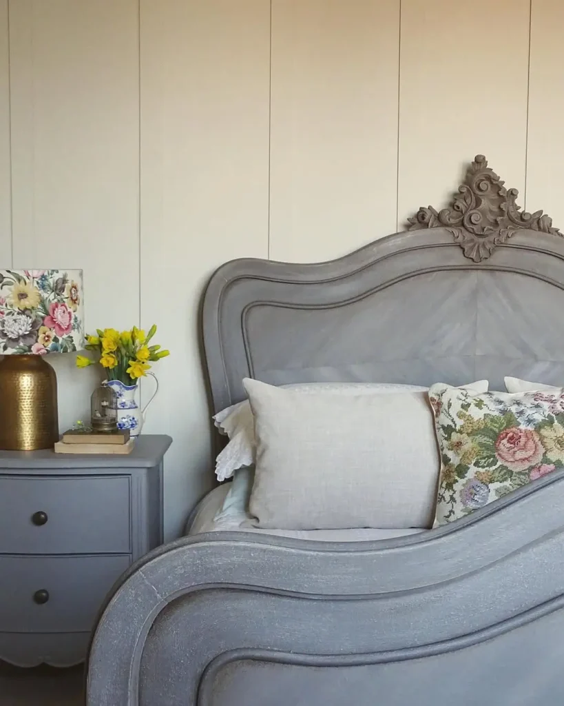
11. Wisteria & Sand: Softly Romantic
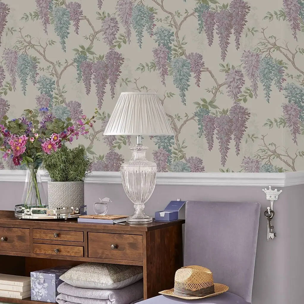
This palette is gentle and quiet, and is made for rooms that feel restful and a little nostalgic. Wisteria brings in a muted violet tone that’s soft but never overly sweet. Sand rounds it out with warmth and balance, like a linen throw draped over a well-worn chair.
It’s a lovely choice for bedrooms, especially when you want a space that feels collected and calm. If you’re creating a retreat of your own, explore our guide to styling a French Country bedroom retreat.
Add in floral fabrics, weathered woods, and layers of light to complete the mood.
12. Classic Neutrals: The Soul of French Country Color Palettes
Ivory. Taupe. Pale gray. Soft beige. These are the tones that ground every French Country space. They offer a timeless base—one that lets textures and layers take the lead. Picture soft linen curtains fluttering against plaster walls or a woven rug grounding a quiet reading nook.
Classic neutrals work in every room and with every season. They create flow throughout the home, making transitions feel natural and easy. When you’re choosing paint, upholstery, or drapery, explore our curated French Country paint and fabric picks for inspiration.
Once your base is in place, add color with restraint—washed blue, sage, or terracotta all pair beautifully with these soft, foundational tones.
How to Use French Country Color Palettes in Your Home
Start with your foundation. Choose one or two colors that set the tone, then build around them with texture, contrast, and light.
Keep the palette soft and cohesive. Repeat your core hues through walls, textiles, and accents. Avoid high contrast or overly saturated tones—they can overwhelm the gentle mood French Country style depends on.
Natural light plays a big role. Warm tones shine brightest in morning sun, while cooler hues deepen beautifully in lower evening light. Let the room’s function and feel guide your choices.
And most importantly, don’t overcomplicate it. Choose what feels lived-in and lasting. If you’re unsure where to begin, avoid pitfalls by reading our post on common mistakes when decorating with color.
Final Thoughts: Finding Your French Country Mood
Color sets the tone for how a home feels and French Country palettes do it with quiet confidence.
Whether you lean earthy or airy, muted or warm, let these combinations guide your way.
And if you’re ready to explore the look even further, don’t miss our ultimate guide to French Country home decor.
Happy styling!
Pin this post to revisit when you’re ready to bring the look to life!