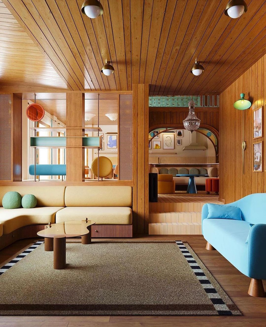
Curious about transforming your space?
Join me in unraveling the secrets of ‘How to Use Bold Retro Colors in Your Home.’
Have you ever felt the magnetic allure of vibrant retro colors, beckoning you to infuse your living space with personality and energy?
In this post, we’ll explore the magic of using bold retro colors to transform ordinary spaces into extraordinary living spaces of self-expression.
From the timeless allure of bold retro colors to choosing the perfect color palette, diving into the color trends of different decades, and exploring real-life examples, we will go on a visual adventure. We will delve into the world of DIY projects, learn to balance boldness with neutrals, and discover the impact of statement furniture and focal points.
Now, as we will venture into the realms of lighting, textures, and practical implementation tips, we will equip ourselves with the tools to turn our homes into vibrant, retro-inspired havens.
So, whether you’re a seasoned decorator or just starting, have fun with the process, and turn your home into a masterpiece of balanced brilliance.
How to Use Bold Retro Colors in Your Home
Now that we’ve set the stage for our colorful journey, let’s delve into the mesmerizing allure of bold retro colors. Imagine stepping into a room that not only looks visually stunning but also evokes a palpable sense of emotion and energy. That’s the magic of choosing hues that pop and sizzle – they have the extraordinary ability to transform a space from the ordinary to the extraordinary.
Bold retro colors go beyond mere aesthetics; they’re mood enhancers, injecting life and character into your surroundings. Whether it’s the rich, warm tones reminiscent of mid-century design or the vibrant, electric hues of the ’80s, each color brings with it a unique personality. It’s not just about decorating; it’s about crafting an experience that resonates with you every time you walk through the door.
Imagine a bold, sunflower yellow accent wall radiating positivity, or a deep, oceanic blue invoking a sense of calm. These colors aren’t just on the walls; they’re woven into the fabric of your home, creating a narrative that reflects your taste, style, and the energy you want to infuse into your living space.
What makes the Right Bold Retro Color Palette
Now that we’ve uncovered the enchanting world of bold retro colors, let’s dive into the exciting task of choosing the perfect color palette for your space. While it might seem like a daunting task, fear not! It’s all about finding the hues that resonate with you and harmonize with your existing decor.
First things first, consider what speaks to your soul. Are you drawn to the earthy vibes of the ’70s, the neon brilliance of the ’80s, or the pastel dreams of the ’60s? Each era brings its own unique palette, so take a trip through time and discover which one aligns with your personal style.
When crafting your palette, think beyond individual colors; consider the relationships between them. Do you want a monochromatic scheme for a calming effect, or perhaps a complementary palette for a bold statement? Understanding the psychology of colors can guide you in creating a space that not only looks good but also feels right.
For instance, a palette inspired by the funky ’60s might include mustard yellows, avocado greens, and burnt oranges. These warm, earthy tones can infuse your space with a nostalgic charm. On the other hand, if you’re vibing with the energetic ’80s, think electric blues, hot pinks, and vibrant purples for a bold and lively atmosphere.
Retro Color Trends Through the Decades
Now that you’re armed with the knowledge of choosing the right color palette, let’s take a captivating stroll down the memory lane of retro color trends. Each decade brought its own distinct flavor, contributing to the rich tapestry of design history. So, fasten your seatbelts as we explore the fascinating evolution of hues from the ’60s to the ’90s.
The Groovy ’60s
Picture this: peace signs, bell-bottoms, and a riot of color. The ’60s were all about breaking free from the monotony, and the color palette echoed that sentiment. Think psychedelic purples, mustard yellows, and avocado greens. It’s a palette that exudes a sense of freedom and creativity, perfect for those who want to infuse a whimsical, retro charm into their spaces.
The Funky ’70s
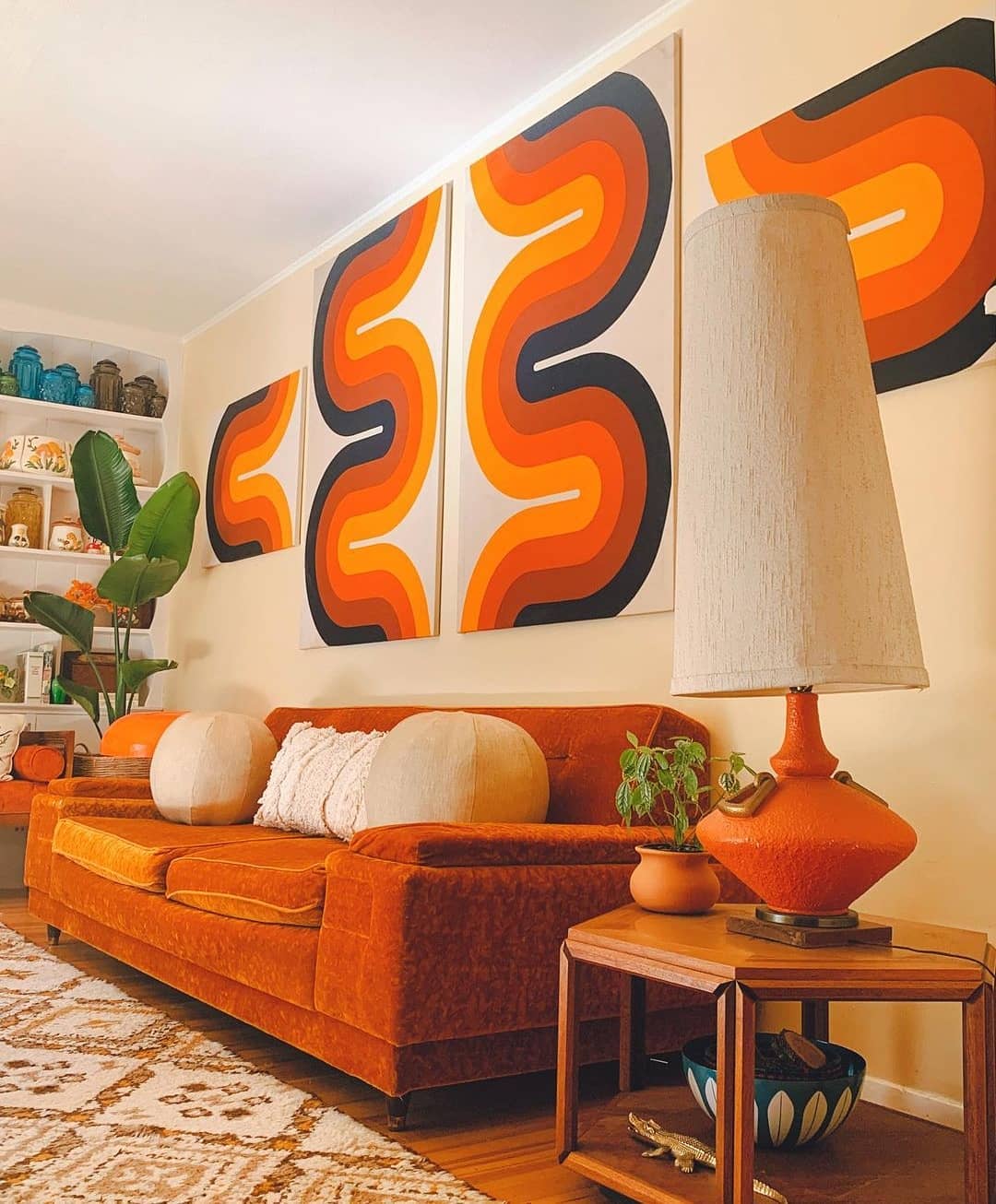
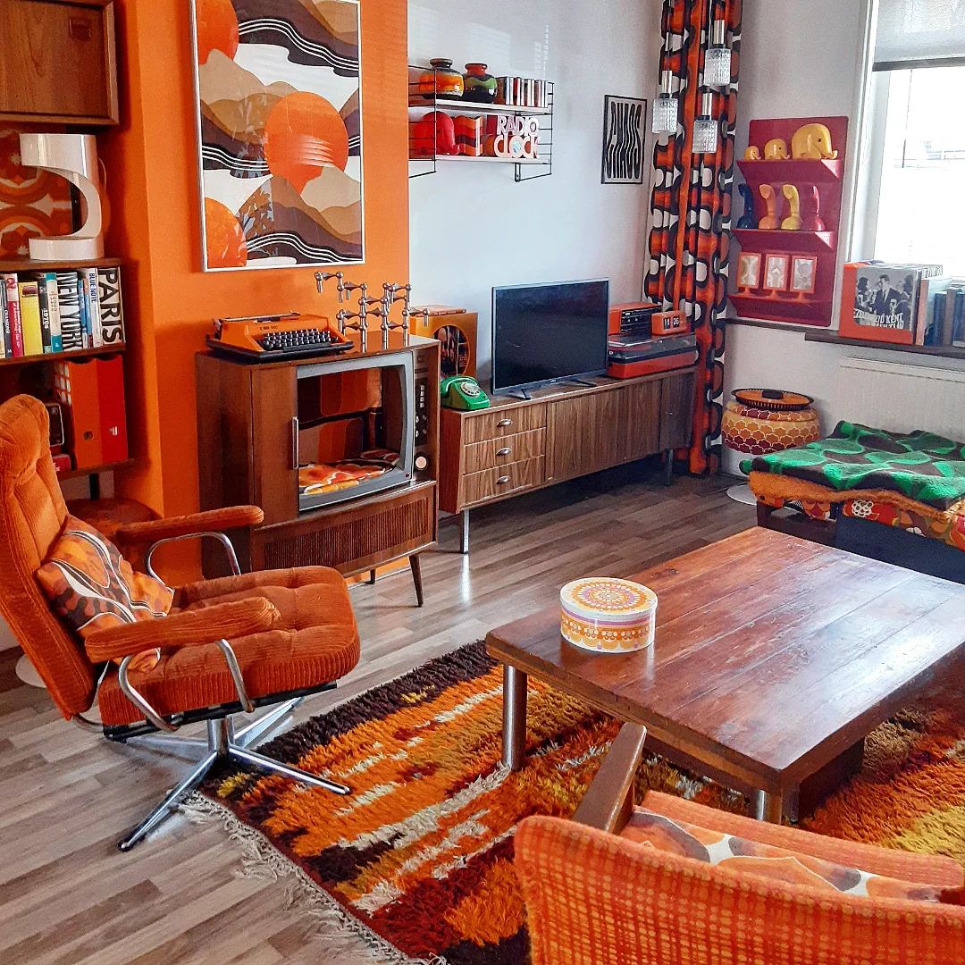
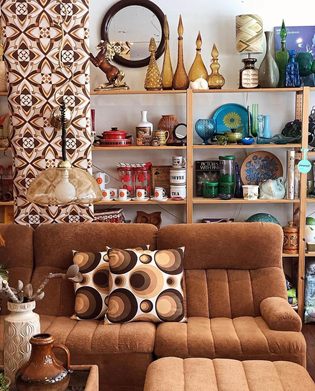
Moving into the ’70s, we find ourselves surrounded by earthy tones and nature-inspired hues. Browns, oranges, and greens dominated the scene, creating a warm and inviting ambiance. If you’re a fan of bohemian vibes and a cozy, grounded feel, the ’70s color palette might be your perfect match.
The Electric ’80s
Fast forward to the ’80s, where excess was the name of the game. Neon took center stage, accompanied by bold, contrasting color combinations. Electric blues, hot pinks, and vibrant purples brought an energetic and lively atmosphere to homes. If you crave a bold and dynamic space, the ’80s palette is your go-to inspiration.
The Pastel Dreams of the ’90s
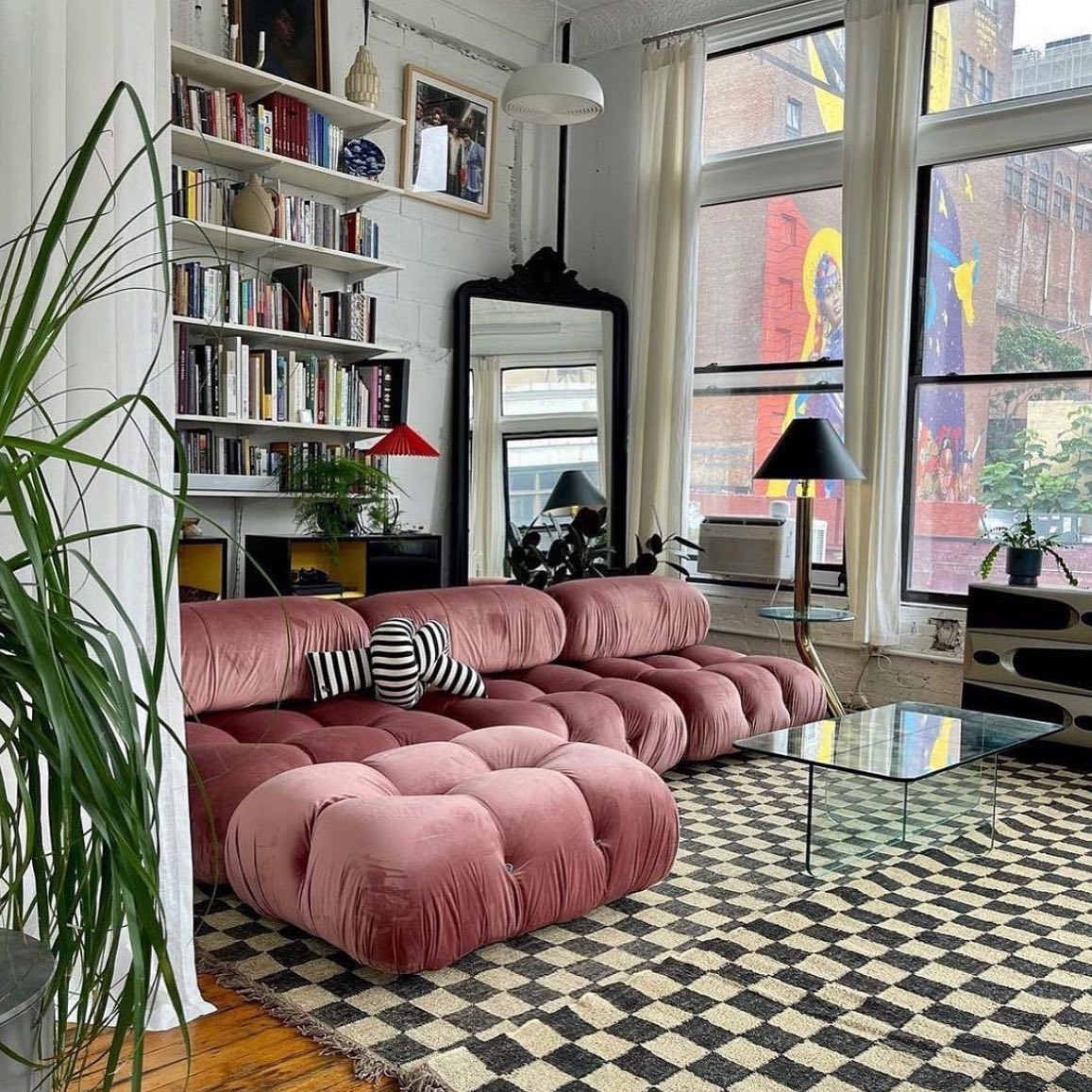
Closing out our journey in the ’90s, we encounter a shift to softer, pastel hues. Mauves, baby blues, and muted greens dominated interiors, creating a more subdued and calming atmosphere. This palette is perfect for those who appreciate a touch of nostalgia without the boldness of previous decades.
As you navigate through these decades of design, consider which era resonates with your personal style. Whether you’re drawn to the free-spirited ’60s, the earthy ’70s, the vibrant ’80s, or the pastel dreams of the ’90s, each decade offers a unique palette to play with. So, channel your inner time traveler and let the colors of the past inspire a bold and beautiful future for your home. The next step? Bringing these retro color trends to life in your space!
Explore Real-life Space with Bold Retro Colors
Ready to see the magic unfold? Let’s step into real homes where bold retro colors take center stage, transforming ordinary spaces into extraordinary showcases of personal style and creativity. These featured spaces are not just rooms; they are stories waiting to be told.
The Vibrant Living Room
Imagine entering a living room where a statement wall adorned in mustard yellow brings warmth and energy to the space. Paired with sleek mid-century furniture and pops of teal and orange accents, this room becomes a vibrant haven, inviting you to relax and revel in its lively ambiance.
The Eclectic Kitchen
Now, let’s venture into the heart of the home – the kitchen. Picture cabinets painted in a daring electric blue, contrasting with bright red appliances and funky geometric tiles. This eclectic mix of bold retro colors turns cooking and dining into a visually stimulating experience, making every meal a celebration.
The Cozy Bedroom Retreat
In the bedroom, witness the transformation of a cozy retreat with a palette inspired by the soothing hues of the ’70s. Earthy tones of brown and green create a calming atmosphere, while pops of orange in the bedding and decor add a touch of warmth and personality. It’s a perfect blend of comfort and style.
The Playful Kids’ Room
For the little ones, why not create a playful haven bursting with colors? Picture a kids’ room where primary hues take the lead – from a bright red bed frame to vivid blue walls. It’s a space that sparks creativity and imagination, making bedtime a fun and exciting adventure.
The Bohemian Workspace
For those who work from home, consider a bohemian-inspired workspace. Earthy tones mixed with vibrant patterns create an inspiring and energizing environment. A bold retro color palette in your home office can turn a mundane workday into a creative journey.
DIY Projects and Accents with Bold Retro Colors
Now that you’ve been inspired by these fabulous retro-infused spaces, let’s talk about how you can bring those bold colors into your own home with some hands-on creativity. Enter the world of DIY projects and accents – the perfect way to infuse personality into your space without a major overhaul.
Funky Throw Pillows
One of the easiest and most effective ways to introduce bold retro colors is through throw pillows. Get your hands on some vibrant fabrics in your chosen palette and let the sewing machine (or fabric glue) do the talking. Whether it’s geometric patterns or funky prints, these pillows will add an instant pop of color to sofas, chairs, or beds.
Colorful Rugs
Step onto a canvas of color with a DIY rug project. Take a plain rug and unleash your creativity with fabric dyes or stencils. Create patterns inspired by your favorite retro era – think bold stripes, mod circles, or even a psychedelic burst. A statement rug can tie the entire room together and become a conversation starter.
Artsy Wall Hangings
Blank walls? No more. Craft your own wall art using canvases, fabric, or even repurposed materials. Create abstract pieces with bold brushstrokes or opt for a more structured approach with geometric shapes. Your walls can become a gallery of your own making, showcasing the bold retro colors that define your style.
Related Post: From Hippie to Chic: How to Style Bohemian Macrame Wall Hangings
Upcycled Furniture Makeover
Give old furniture a new lease on life with a splash of color. Whether it’s a vintage dresser, a plain bookshelf, or a tired coffee table, a fresh coat of paint in a bold retro hue can transform it into a statement piece. Experiment with patterns or leave it solid – the choice is yours.
Color-Blocked Accent Wall
If you’re feeling a bit bolder, consider a color-blocked accent wall. Choose two or three complementary colors from your retro palette and paint sections of the wall to create a visually striking effect. It’s a DIY project that demands attention and adds a touch of drama to any room.
These DIY projects and accents allow you to actively participate in the transformation of your space. The beauty lies in the personal touch you bring to each project, making your home truly one-of-a-kind. So, roll up your sleeves, gather your materials, and let your inner artist shine. The result? A home that not only reflects the boldness of retro colors but also the uniqueness of your creative spirit.
Balancing Boldness with Neutrals
Now that you’re adding those vibrant retro colors to your space, it’s essential to strike a balance. Think of it as creating a symphony where bold colors are the lead instruments, and neutrals play the supporting notes, creating harmony in your decor composition.
Neutral Foundations
Start by establishing a neutral foundation. Consider neutral colors for larger elements like walls, furniture, and flooring. This provides a clean and timeless backdrop that allows your bold retro colors to shine without overwhelming the space. Think whites, grays, or earthy tones for a balanced canvas.
Accenting with Bold Colors
Now, let’s bring in the stars of the show – your bold retro colors. Use them strategically as accents to draw attention to specific areas. Whether it’s a brightly colored sofa, vibrant artwork, or accent furniture, these elements become focal points that inject life and personality into the room.
Creating Visual Flow
Achieve a seamless transition between bold and neutral by creating a visual flow. Consider the layout and placement of colors throughout the space. This could mean introducing pops of color in a thoughtful sequence, guiding the eye from one area to another. The goal is to create a cohesive and balanced visual experience.
Textures for Depth
Textures play a crucial role in balancing bold colors. Introduce varied textures in neutral tones to add depth and visual interest. Think of a plush neutral-colored rug, textured throw blankets, or curtains in natural fabrics. These elements soften the overall look and prevent the space from feeling too intense.
Accessorizing Thoughtfully
Accessories can be your secret weapon in achieving the right balance. Opt for neutral accessories like cushions, vases, or candles to complement the bold colors in the room. This allows you to experiment with different color combinations without committing to a permanent change.
The Rule of Three
As a general guideline, consider the rule of three when incorporating bold colors. Choose three main colors from your retro palette and use them consistently throughout the room. This ensures a cohesive look without overwhelming the senses.
Statement Furniture and Focal Points in Bold Retro Colors
Now that we’ve mastered the art of balancing boldness with neutrals, let’s turn our attention to creating statement pieces and focal points within your space. These elements not only showcase your chosen retro colors but also become the stars of your decor narrative.
Bold-Colored Furniture
Consider investing in a piece of furniture that boldly embodies your chosen retro hues. Imagine a sofa in a vibrant red or an armchair in a rich teal. These statement pieces not only add personality to your space but also serve as a focal point that immediately captures attention upon entering the room.
Eye-Catching Wall Art
Turn your walls into a gallery of bold expressions. Whether it’s a large canvas painting, a collection of framed prints, or even a DIY mural, let your wall art become a visual feast of retro colors. This not only adds personality to the room but also serves as a conversation starter.
Playful Patterns
Patterns are a fantastic way to introduce bold colors in a cohesive manner. Think geometric wallpaper, chevron-patterned rugs, or floral-printed curtains. These patterns not only infuse energy into the room but also contribute to the overall theme, tying different elements together.
Colorful Accents as Focal Points
Consider using smaller yet impactful elements as focal points. This could be a uniquely shaped mirror in a bold frame, a vibrant lampshade, or even a collection of colorful books strategically displayed on a coffee table. These accents draw the eye and contribute to the overall visual interest of the space.
Create Zones with Color
Define different zones within a room using bold colors. For example, a dining area with a bold-colored table and chairs, or a reading nook with an accent chair and a brightly hued bookshelf. This zoning technique not only adds a sense of purpose to each area but also showcases your chosen colors in a structured way.
Strategic Use of Contrast
Enhance the impact of statement furniture and focal points by strategically using contrast. If your walls are neutral, a bold-colored sofa against them immediately becomes the center of attention. Similarly, placing a vibrant piece against a neutral backdrop creates visual drama without overwhelming the space.
Lighting, Textures, and Bold Retro Colors
Now that your space is taking shape with bold retro colors and statement pieces, let’s explore how lighting and textures can elevate the overall aesthetic. These elements play a crucial role in enhancing the ambiance, creating depth, and adding that extra layer of visual interest to your vibrant home.
Ambient Lighting Magic
Consider lighting as the unsung hero of your decor ensemble. Choose fixtures that not only illuminate but also complement your bold color palette. Pendant lights, chandeliers, or even floor lamps can be the perfect allies in setting the mood. Picture warm, golden lighting accentuating the richness of your retro hues.
Textured Delights
Textures introduce a tactile dimension to your space, making it more inviting and visually appealing. Think plush rugs, textured throw blankets, or cushions with varying fabrics. These elements not only add comfort but also break up the visual monotony, creating a dynamic and layered look.
Colorful Lampshades and Bulbs
Why settle for ordinary lighting when you can make a colorful statement? Opt for lampshades in bold retro colors or even experiment with colored light bulbs. This not only adds a playful touch but also becomes an extension of your chosen color palette, turning lighting fixtures into decorative pieces themselves.
Natural Elements in Neutral Tones
Bring the outdoors in by incorporating natural textures in neutral tones. Wooden furniture, rattan baskets, or stone surfaces can add an earthy contrast to your vibrant color scheme. This combination creates a harmonious balance, connecting your interior space with the beauty of the natural world.
Mirrors for Visual Expansion
Strategically placing mirrors can work wonders in a boldly colored space. Mirrors reflect light and create the illusion of a larger, more open area. Consider bold, uniquely shaped mirrors as both functional and decorative elements. They not only contribute to the visual expansion but also become striking focal points on your walls.
Contrast with Metallic Accents
Introduce a touch of glamour with metallic accents. Picture gold or brass frames, metallic light fixtures, or even chrome furniture against your bold retro colors. This contrast adds a sophisticated edge, creating a visually compelling and well-balanced ambiance.
Practical Tips for Decorating with Bold Retro Colors
Now that you’ve absorbed the essentials of infusing your home with bold retro colors, let’s wrap things up with some practical tips to guide you on this vibrant journey. Consider these as your roadmap for seamlessly implementing the retro aesthetic into your living space.
- Start Small, Dream Big: If you’re new to bold colors, dip your toes in gradually. Begin with smaller elements like throw pillows, rugs, or accent pieces. As you become more comfortable, you can progressively introduce bolder hues in larger areas.
- Embrace the Power of Samples: Before committing to a full wall or large piece of furniture, test your chosen colors with paint samples or fabric swatches. This allows you to see how the colors interact with your existing decor and ensures you’re satisfied with the final result.
- Experiment with Color Combinations: Don’t be afraid to mix and match colors from different retro eras. Experiment with combinations that resonate with you, keeping in mind the mood you want to create. The beauty of retro is the freedom to blend various palettes for a truly personalized look.
- Keep Neutrals in the Mix: Maintain a balance by incorporating neutral tones alongside your bold colors. This prevents the space from feeling overwhelming and provides visual breathing room. Neutrals act as the canvas on which your vibrant colors can shine.
- Cohesiveness Across Spaces: Ensure a sense of cohesiveness by carrying elements of your chosen color palette throughout different rooms. This creates a unified aesthetic, allowing your home to flow seamlessly from one space to another.
- Personalize with DIY Projects: Inject your personality into the decor through DIY projects. Whether it’s a custom artwork, upcycled furniture, or handmade accessories, these personal touches make your space uniquely yours and contribute to the retro charm.
- Regularly Rotate Accessories: Keep things fresh by periodically changing out accessories. Swap out throw pillows, rearrange decor items, or introduce new accents to keep the space dynamic and prevent it from feeling stagnant.
- Take Inspiration from Your Surroundings: Let your environment inspire your color choices. Draw from the natural elements around you, be it the colors of a favorite artwork, the hues of your garden, or the tones of a memorable travel destination. Your surroundings can guide your retro color palette in unexpected and delightful ways.
- Trust Your Instincts: Ultimately, trust your instincts and have fun with the process. Your home is a reflection of you, so embrace the colors that resonate with your personality and bring you joy. Let the process be a creative and enjoyable exploration of your unique style.
As you embark on transforming your space with bold retro colors, remember that there are no strict rules – only guidelines to inspire you. The most important aspect is creating a home that feels like a true extension of yourself.
Conclusion
As we wrap up this colorful exploration, remember that home decor is not just about aesthetics; it’s about crafting an environment that tells your story.
By infusing your space with the allure of bold retro colors, you’ve embraced a design journey that celebrates individuality, creativity, and the joy of self-expression. Your home is now a living testament to the harmonious balance of vibrant hues and thoughtful neutrals, creating an ambiance that’s uniquely yours.
Your home is more than just walls and furniture; it’s a sanctuary that mirrors your journey, your memories, and your dreams. Let the bold retro colors be the backdrop to a life well-lived, where every corner is a reminder of the joy found in self-expression.
Thank you for joining us on this vibrant adventure.
Until our next decor escapade, keep embracing the beauty of boldness, and let your retro-infused haven be a reflection of the wonderfully unique person you are.
Happy decorating!
Related Posts:
- A Guide to Decorating Your Home with Bold Colors
- Smeg Fridges: How to Add Retro Style to Your Kitchen
- Colorful and Eclectic: How to Create a Boho Maximalist Bedroom
- Beyond Color: Unconventional Techniques for Uplifting Your Home’s Vibe
- Curb Appeal Delight: Bold and Beautiful Front Door Color Ideas

